
1448 Agency
Background
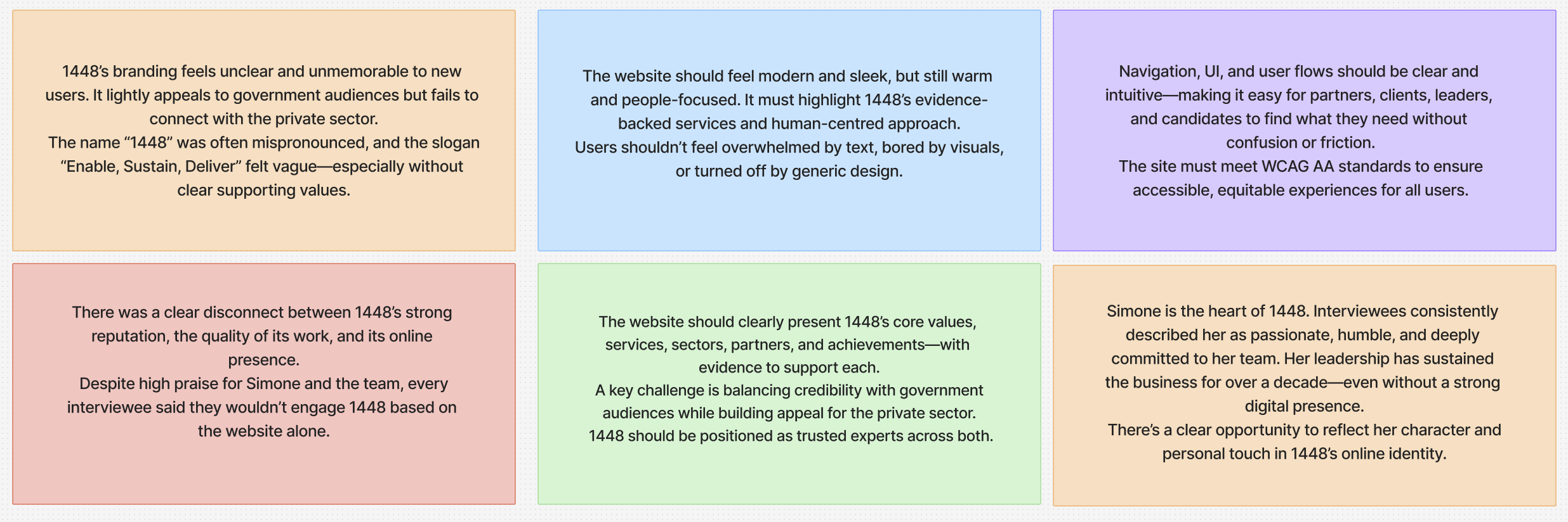
Over the years, 1448 earned a reputation as a warm, people-first agency, trusted to deliver end-to-end projects across the public sector. Yet, despite a strong track record, the brand lacked a distinctive digital presence and clear visual identity. Founder Simone set out to change that, seeking a scalable, modern refresh that honoured 1448’s government roots while opening the door to new private-sector opportunities.
Role
UI Designer on a cross-functional team, contributing to 1448’s front-end refresh through component design, responsive layouts, and WCAG AA accessibility in close collaboration with UX research and graphic design.UI Designer (part of a five-member UI design team)

Overview — Project 1448
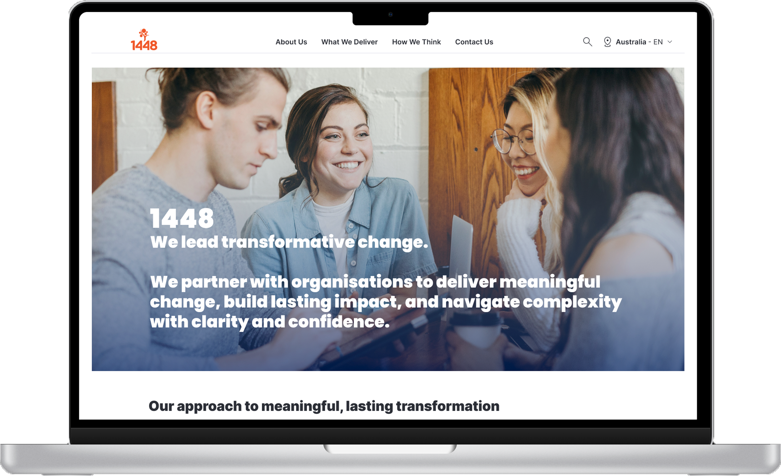
In a focused 4-week design sprint, I worked within a cross-functional team (five UI, five UX, three graphic designers) to deliver a fully responsive, WCAG 2.1 AA-compliant website. I supported research through heuristic evaluation, competitor analysis, user flows, personas, and interview analysis, then translated insights into information architecture and wireframes. I built a scalable component-based design system, designed the landing page and responsive navbar, and collaborated closely across teams to navigate complex constraints—resulting in an accessible, cohesive, and development-ready experience.
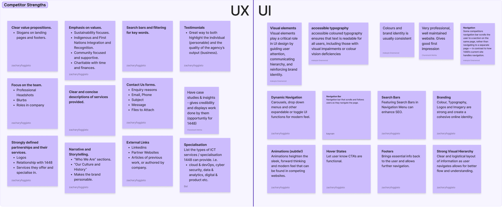
Competitor Analysis
I collaborated with the research team on a cross-functional competitor analysis, alongside a heuristic review of our current site. With 13 team members across UX, UI, and graphic design, we gathered insights that revealed key areas for improvement.
As a UI designer, I focused on visual consistency, layout structures, and interaction models across both public and private sector sites. These findings helped guide our recommendations for a refreshed design direction.

As part of our 17-site competitor review, I analysed EY’s website to identify UI patterns that support clarity, scalability, and brand consistency.

Interviews and Personas
User research was led by a team of five researchers who conducted interviews, identified key patterns, and developed detailed user personas.
Although I wasn’t involved in the interviews, the insights they uncovered were critical to shaping the design direction. The personas helped us understand user goals, frustrations, and behaviours—giving the design team a clear foundation for decision-making.
They guided everything from layout priorities and navigation flows to tone of voice and content structure, ensuring that every design choice was grounded in actual user needs.
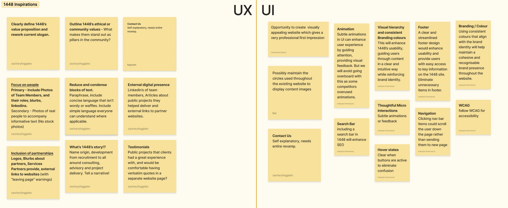
Key Insights & Synthesis
Using insights from the heuristic evaluation, competitor analysis, and user interviews, we identified recurring themes and patterns. After reviewing the initial groupings, I reorganised the findings into the key insights that shaped our direction.
Defining the Challenge: Problem Statement, Ideation & HMWs (How Might We)
To kick off the UI handover, we ran a collaborative ideation session with leads from UI and graphic design. We revisited the core insights, aligned on a clear problem statement, and framed key “How Might We” questions. From there, we voted to surface the most impactful ideas to take forward.


This session helped us refine the Problem Statement and shape final “How Might We” questions—turning key insights into actionable design opportunities. We iterated on the original HMWs to make them more specific and useful for guiding the design team.

Information Architecture
Creating the Information Architecture was a complex, iterative process. Starting with a minimal online structure, we collaborated closely with the UI team and project lead to build a layout grounded in user needs and research.
After multiple revisions, we landed on a hierarchy that improves content flow, supports future growth, and aligns with 1448’s evolving goals.
Below is the initial IA framework, followed by the final version:

Initial Layout Overview

Updated Site Structure

Final IA
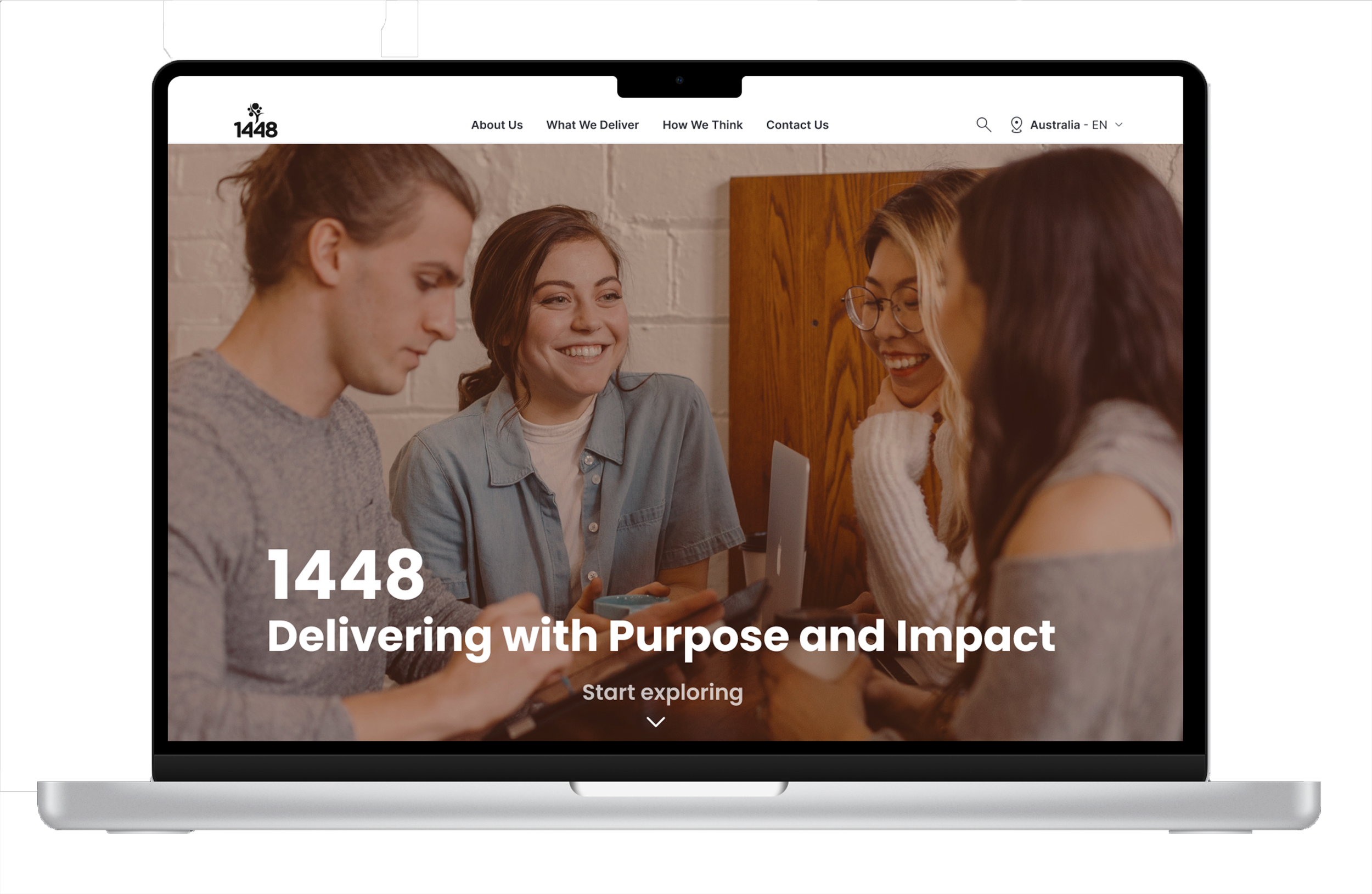
Low-Fidelity Wireframes
As part of the initial design phase, I created low-fidelity wireframes for the Home page and the Work With Us page. These were developed in the first iteration of our design process to establish layout, hierarchy, and core functionality based on early research insights.

First Iteration
Second Iteration
UI DESIGN


First Iteration
Second Iteration
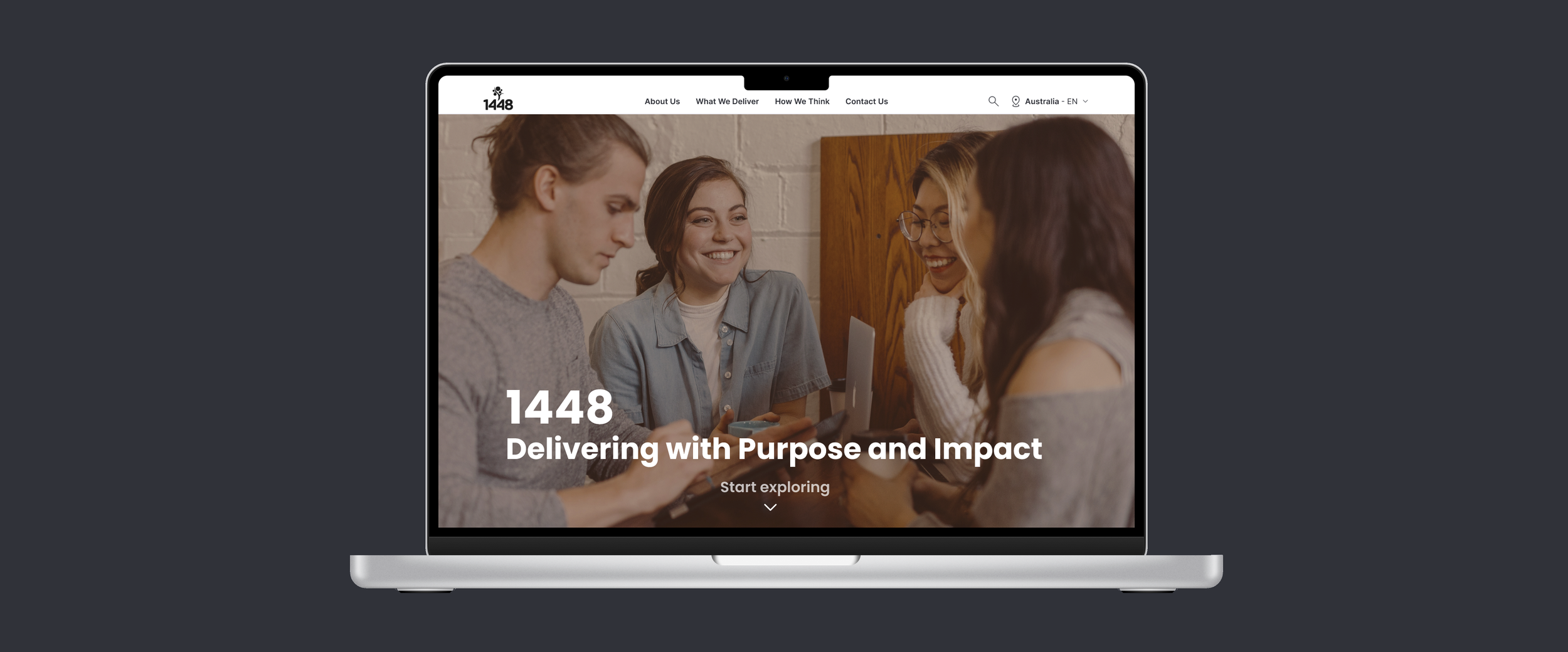
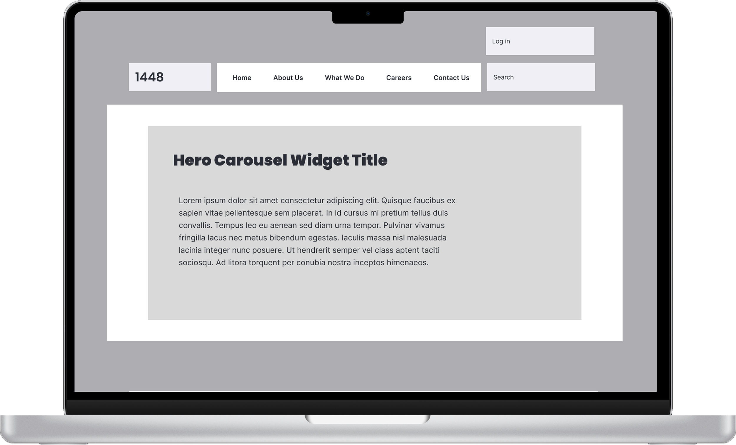
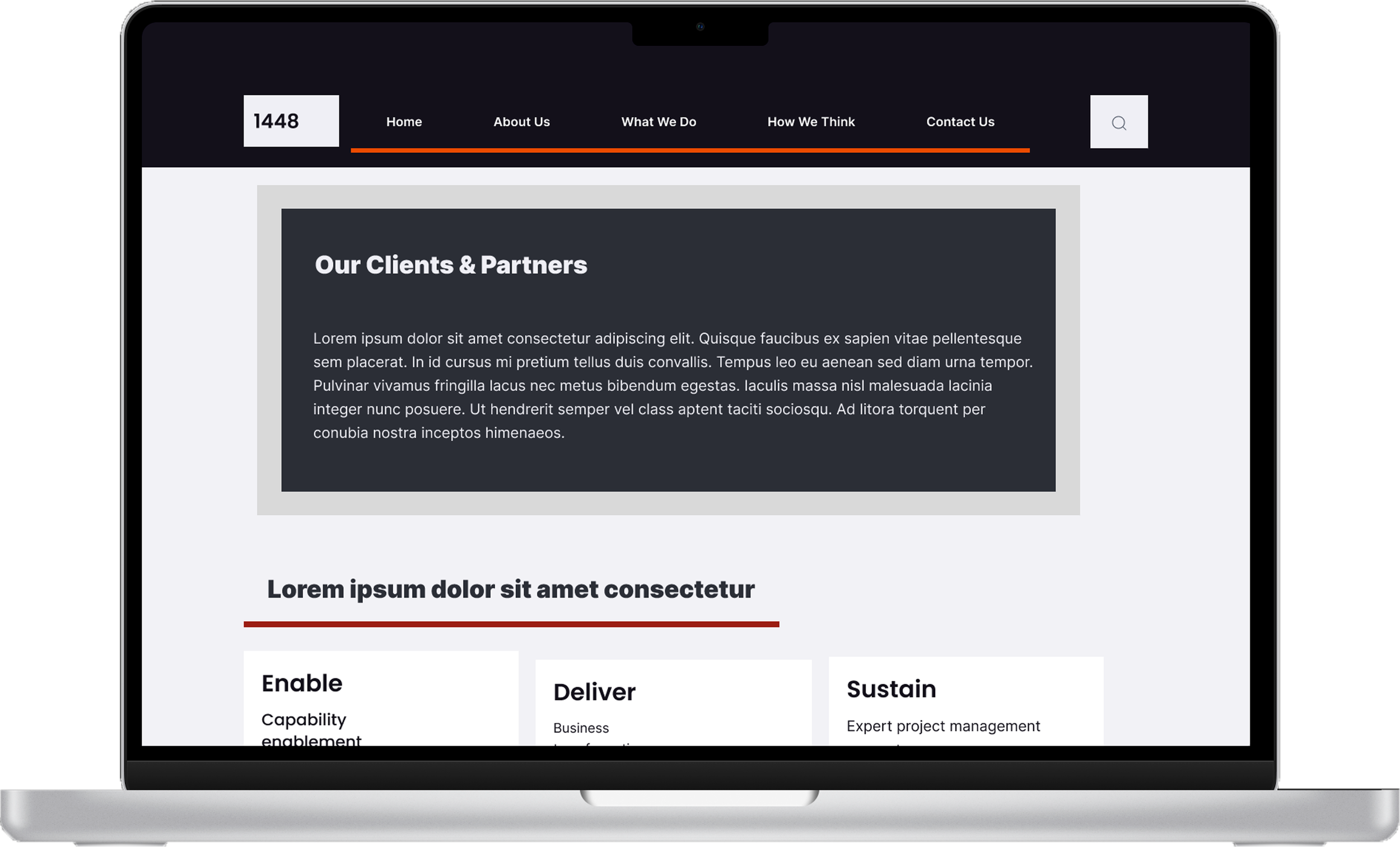
Final Product
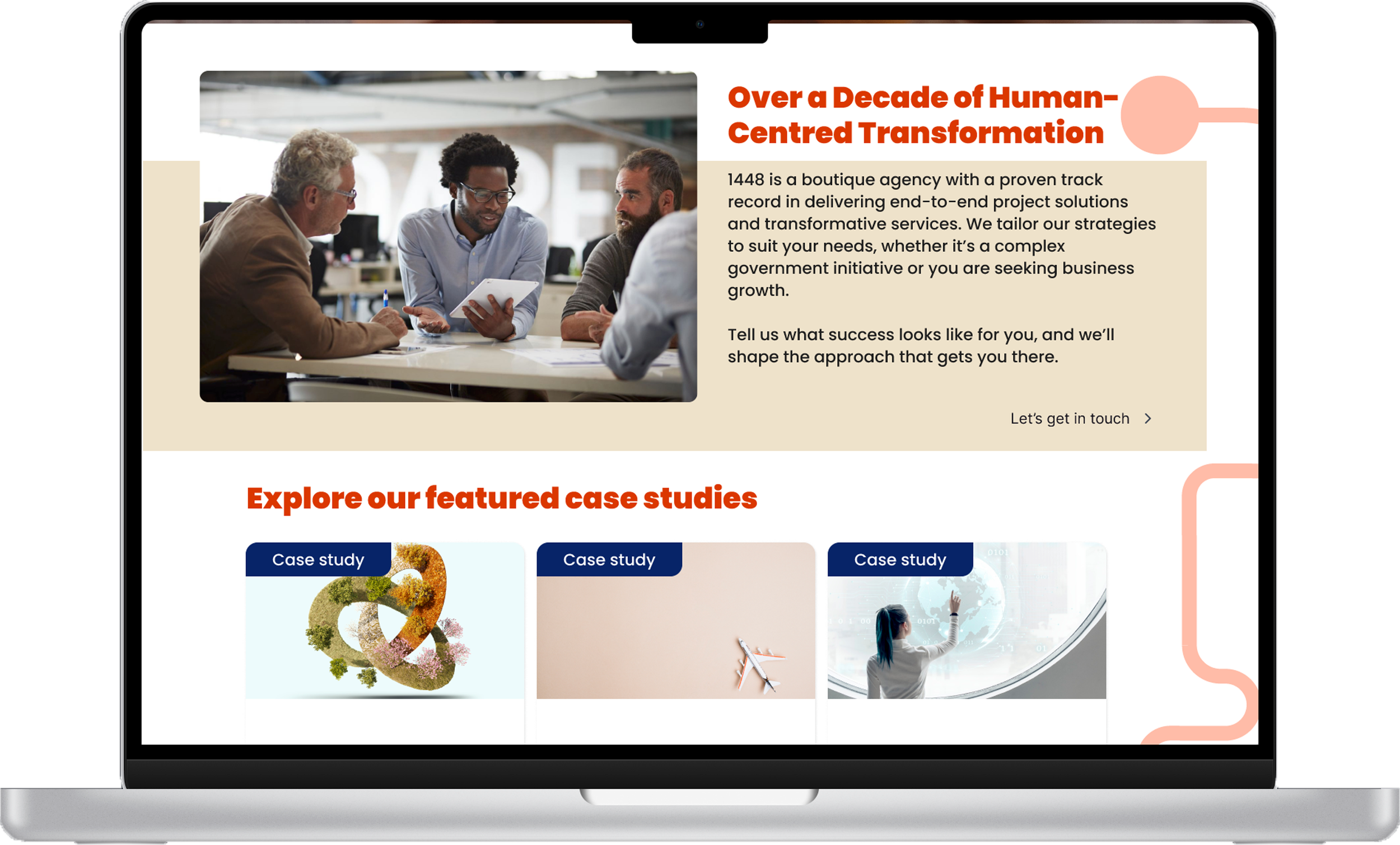
Final Product
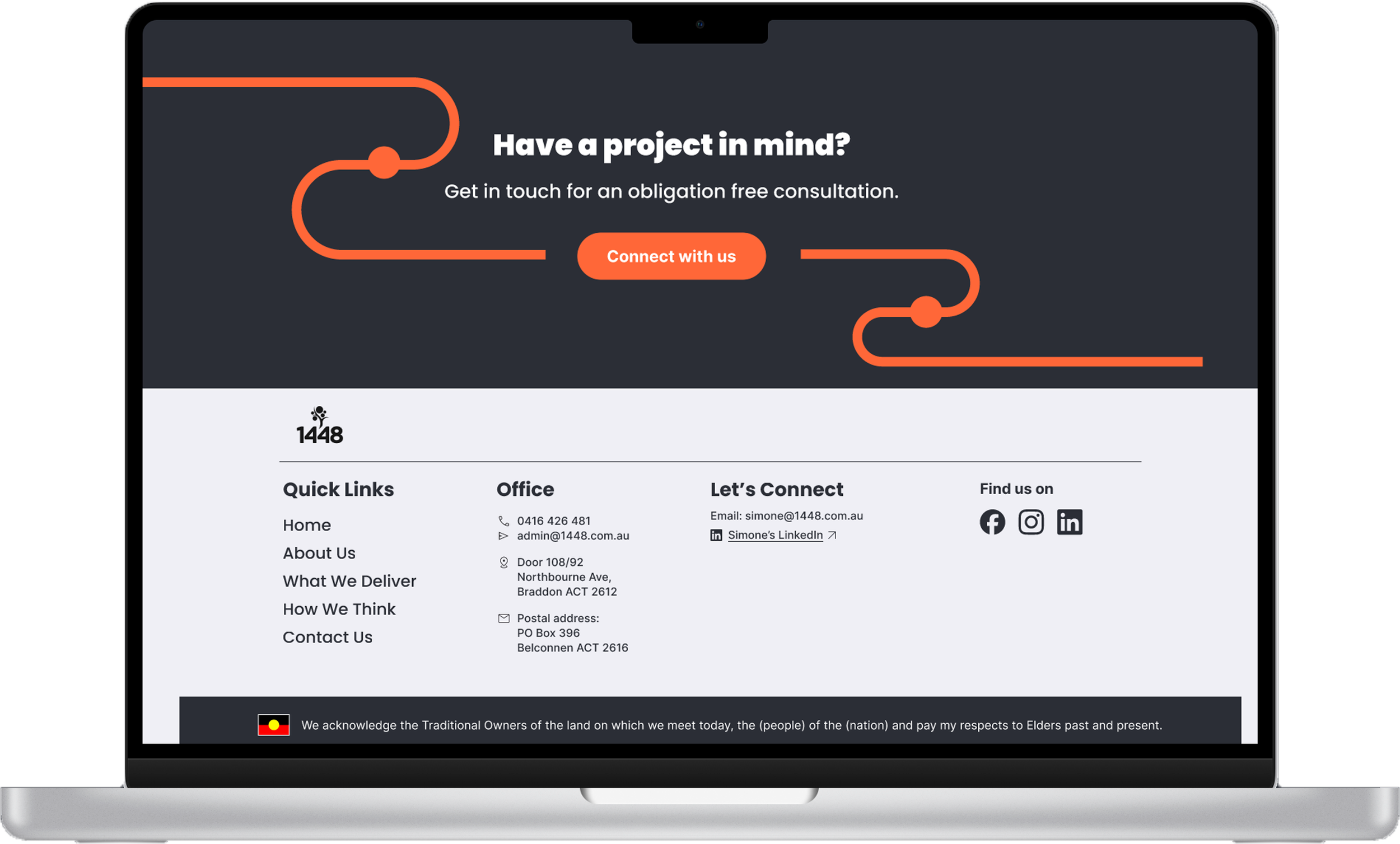
Final Product