

“Books are a uniquely portable magic.”
In the digital age, that magic evolves, connecting readers through sharing, rewards, and stories that travel farther than ever.
— Stephen King
BOOK BOOST
BookBoost — Empowering Families to Read More, Spend Less
BookBoost is a concept developed to address the growing gap between children’s reading habits and the affordability of digital books.
Rooted in insights from user interviews, the project explores how financial constraints, limited access to eBooks, and increasing non-educational screen time are impacting families’ engagement with reading.
Designed as a community-driven eBook platform, BookBoost allows users to borrow, lend, and share digital books within a trusted network of readers. It integrates a reward system that offers points and discount vouchers for lending and borrowing activities — encouraging ongoing reading and supporting sustainable access to diverse books.
By combining accessibility, community, and motivation, BookBoost transforms reading from an isolated task into a shared, rewarding experience, helping children reconnect with stories, imagination, and learning.

Overview
BookBoost is a self-initiated UX case study exploring how design can make digital reading more accessible, social, and rewarding for families. The project responds to user insights around rising eBook costs, limited access, and declining reading engagement among children.
The concept focuses on creating a community-driven eBook platform where users can borrow, lend, and share books, supported by a reward-based system that encourages ongoing reading and collaboration. The outcome is a functional prototype that demonstrates how design thinking can transform reading into a shared, motivating experience that benefits both children and parents..
Role
Full‑Stack UX/UI Designer
I led the end-to-end UX design process for this self-initiated project from early research to the final interactive prototype. My work covered user research, interviews, persona creation, journey mapping, MVP definition, user flows, information architecture, wire-framing, high-fidelity prototyping, and usability testing.
This project showcases my ability to independently manage the full UX lifecycle, translating insights into a user-centred, engaging, and visually cohesive product experience.
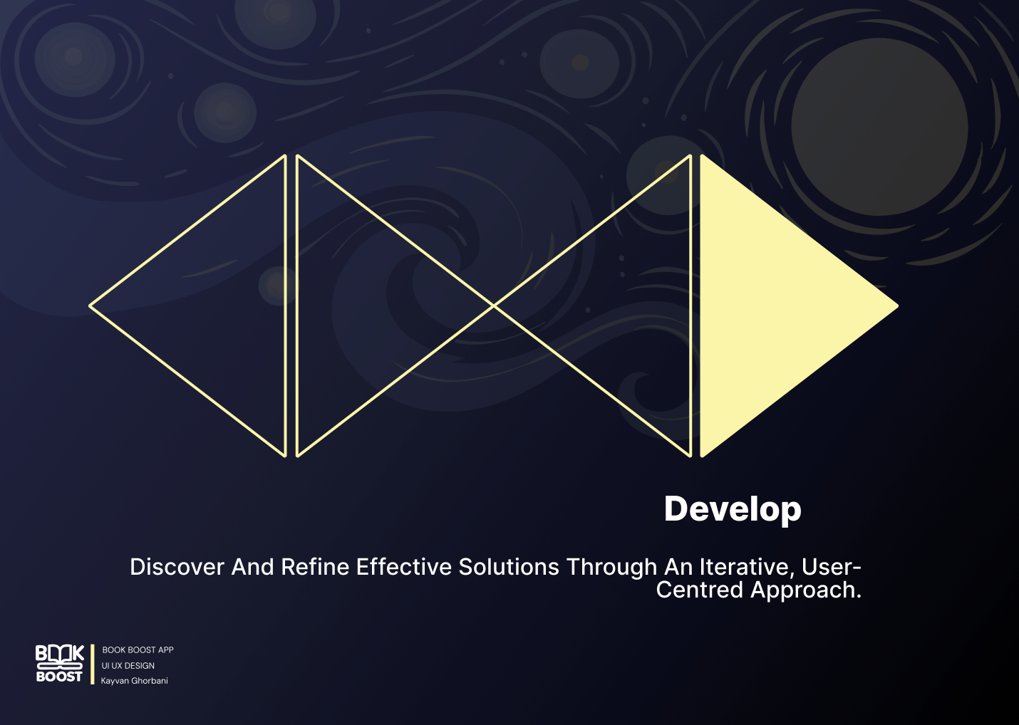
Design Process
I followed the Double Diamond framework to structure the design journey, from exploring user needs to delivering a validated solution.
In the Discover phase, I conducted user interviews and affinity mapping to identify key pain points such as high eBook costs, limited access, and lack of motivation to read.
During Define, I synthesised insights and ran a heuristic evaluation of existing eBook platforms to uncover usability gaps and opportunities. In the Develop stage, I created personas, journey maps, user flows, and wireframes, shaping the foundation for the user experience. Finally, in the Deliver phase, I built high-fidelity prototypes and conducted usability testing, iterating based on user feedback to enhance clarity, engagement, and accessibility. This process ensured that BookBoost evolved from research-driven insights into a user-centred, rewarding, and inclusive reading experience.
Research Plan — eBook Lending
Goal: Validate demand and usability for a children’s eBook lending/borrowing feature.
Methods (mixed):
Surveys · 1:1 interviews · Competitor benchmarking · Heuristic evaluation
Participants:
Budget-conscious parents, educators, and librarians using phones/tablets.
What we asked:
Motivation to lend/borrow · Barriers (cost, discovery, safety) · Desired controls/features · Onboarding and navigation pain points.
Key insights:
Strong appetite for a budget-friendly sharing model.
High interest in community features (class/classroom groups, parent circles).
Clear usability & accessibility gaps in existing apps (onboarding, discovery).
Competitors under-support safe, simple sharing, revealing a differentiation opportunity.
Outcomes Design:
Affinity themes → personas & user flows; IA & wireframes
Problem Statement
Many families—especially budget-conscious parents and educators—struggle to afford new children’s eBooks. This cost barrier reduces reading time and engagement, contributes to declining literacy habits, and shifts children toward more non-educational screen time. There’s a clear need for an affordable way to access a broader range of eBooks without significant additional cost.
Objective: Design and validate an eBook lending/borrowing feature that enables families to share titles from their existing libraries, with simple discovery and incentives (e.g., vouchers/rewards) to sustain reading habits. Success = improved access, higher reading frequency, and a more equitable reading experience for children.
User Personas
I profiled four users: Margaret Thompson (65)—retired, needs affordability and simple navigation; David Reynolds (42)—Google Play Books PM, prioritises metadata and distribution efficiency; Emma Rogers (23)—student, wants fast discovery and offline access on a budget; Sarah Mitchell (36)—mum of two, needs easy family setup and age-appropriate content.

Narrowing the Focus:
Drawing on empathy interviews, clustered insights, and her end-to-end journey, I scoped the MVP for the Build phase. Guiding prompt: “How can we make it easy and low-cost for older caregivers to find and borrow children’s eBooks?” Priority items:
Friction-free sign-up with clear, plain language
Highly readable UI (adjustable type, strong contrast)
Single-tap borrow/return and a tidy “My Books” shelf
Low-cost access (lending credits, periodic deals)
Download for offline use with small file sizes
Straightforward search plus age-based suggestions
Gentle reminders for due dates and “resume reading” prompts
User Challenges Shaping the Design
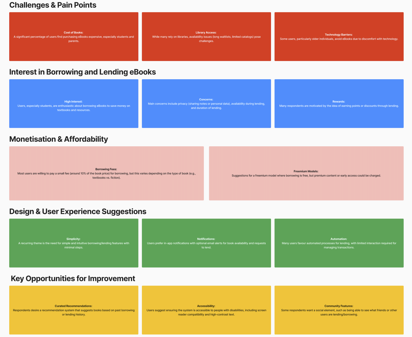
Affordability & Access
Challenge: Books are expensive; library catalogues feel limited or hard to navigate.
Design Focus: Low-cost lending model (credits/freemium), clear availability status, stronger search & curated recommendations to surface the right titles fast.
Simplicity & Automation
Challenge: Users want borrowing to be effortless with minimal steps.
Design Focus: One-tap borrow/return, clean “My Books” shelf, smart notifications (availability, due dates), and lightweight onboarding to reduce drop-off.Trust & Privacy
Challenge: Concerns about data sharing and borrowing rules (who sees what, loan duration, item availability).
Design Focus: Transparent privacy controls, clear lending rules and timers, visible waitlists/holds, and in-app status tracking to set expectations.
User Flow
A concise flow maps how users sign up, lend or borrow eBooks, and join chat discussions, while earning or spending points. It highlights key decision points, system feedback (status, confirmations), error handling, and reward triggers—keeping users informed, engaged, and motivated end-to-end.

Low-Fidelity Wireframes
a set of low-fidelity wireframes designed using a grid layout system to ensure consistency, alignment, and responsive structure across screens. The wireframes outline key user journeys within the eBook mobile app—such as signing up, managing profiles, browsing, lending, borrowing, chatting, and tracking points. The grid-based design supports a clear hierarchy and intuitive navigation, helping to visualise core features like the reward system, lending dashboard, and user notifications while focusing on functional structure over visual detail.

Wireframe Usability Testing
Usability Testing Plan
Goal: Can users borrow, lend, return, and navigate?
Scope: Borrow/Lend flows · Dashboard · Returns · Nav
Participants: 5–7 users (readers/students/casual borrowers)
Method: Figma prototype · Moderated sessions (remote/in-person)
Metrics: Task completion · Errors · Time on task · Satisfaction
Outcome: Surface UX pain points; improve flow, clarity, efficiency.

UI Design
Design System
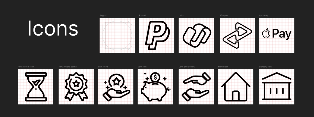
Iconography
This icon set supports the app’s visual language, enhancing usability and keeping the experience consistent across screens. Built on a 24×24 px grid, the icons utilise a monoline, uniform stroke with pixel-precise SVG exports for crisp rendering.
Key highlights
Functional: Covers core actions—Borrow, Lend, Earn Points, Library/Home, Account—plus system feedback.
Consistent style: Shared grid, uniform stroke, simple silhouettes for visual harmony.
Brand integration: Platform marks (e.g., Apple Pay, PayPal, Facebook, Gmail, LinkedIn) and our BookBoost logo, following brand guidelines.
User-centred & accessible: Designed for instant recognition with high contrast, 44px targets, and clear focus states (WCAG AA).
These icons serve as visual anchors throughout the journey, enabling people to navigate and interact with clarity and confidence.
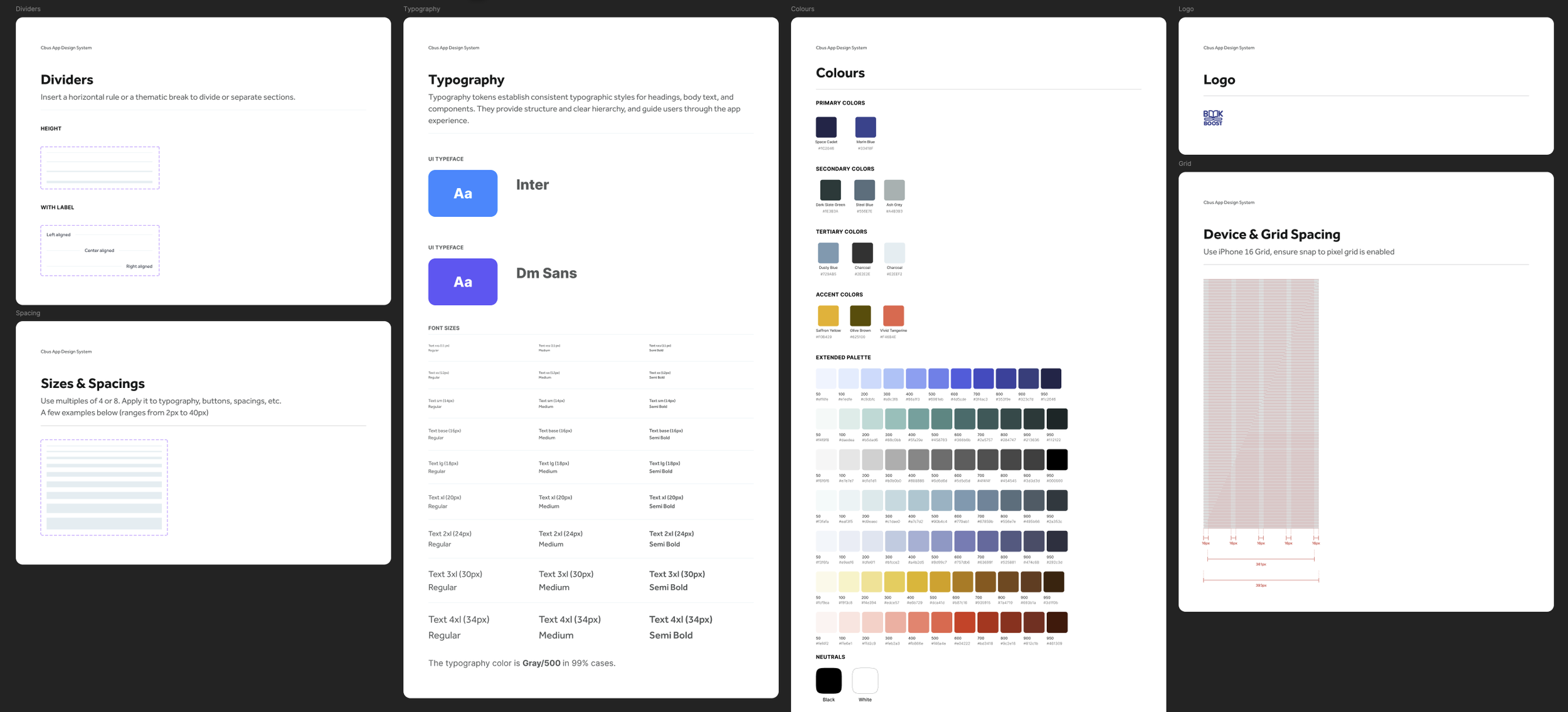
Colour System
“Starry Night” Palette
I built a calm, literary palette inspired by Van Gogh’s The Starry Night: deep blues and greys for primary UI, supported by softer neutral secondarys, and a signature gold (e.g., #5C4C00) for highlights and calls to action.
All primary text/background pairs were checked to WCAG AA contrast. Each colour ships with tints & shades (+90% → −90%) to scale across light/dark themes and varied use cases.
Result: a consistent, accessible system that feels trustworthy for long-form reading while giving designers enough range for hierarchy, states, and brand accents.


Buttons
Variants: solid, outline, ghost
Hierarchy: Primary (main call-to-action), Secondary, Tertiary
Sizes: compact / default / large with responsive hit-areas (≥44px), loading & disabled states
Core Components
Forms & Inputs: text fields, selects, sliders, ratings, toggles
Navigation & Content: tabs, cards, icons
Standards: aligned to the Starry Night colour system, focus/hover/active states
Reusable: structured for consistency and fast dev handoff (tokens + variants)
Modular Layouts
Pre-built cards, avatars, drop-downs, message threads
Optimised for key flows: borrow, lend, chat, and track reading activity
Flexible grids that adapt cleanly from mobile to desktop

Typography
For the eBook mobile app, I chose Inter—a modern, screen-first sans-serif with open letterforms and excellent readability on small displays. Its clean geometry and broad weight range make it ideal for a clear hierarchy while keeping the UI minimalist and accessible.
Key highlights
Font family: Inter — clean, modern, highly legible
Hierarchy: Defined styles for headings, subheadings, body, captions
Weights: Regular, Semi Bold, Bold for clear emphasis
Scalability: Type sizes 28–54px, adaptable across mobile and tablet
Line height: Uniform 24px for consistent vertical rhythm and readability
Final Prototype
Final Prototype — Snapshot
Built with an accessible, cohesive design system—consistent palette, modern type, grid-based icons—and aligned to WCAG 2.1 AA.
-
![]()
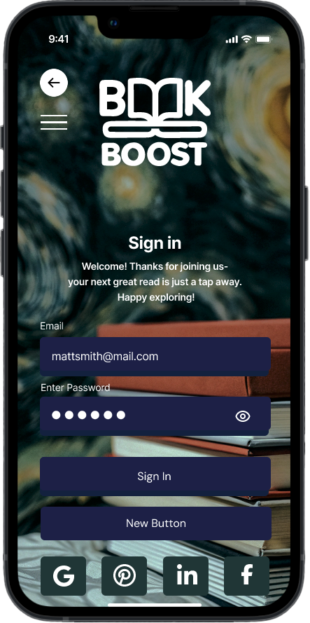
Sign In
-
![]()
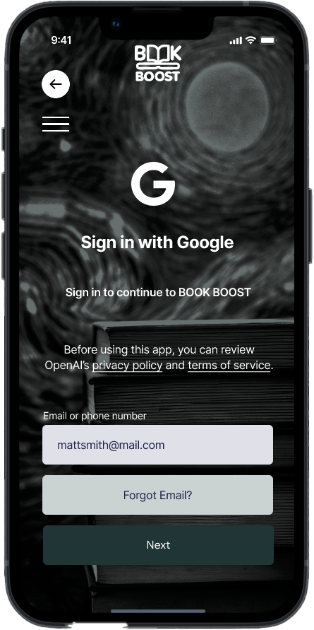
Log In With Google
-
![]()
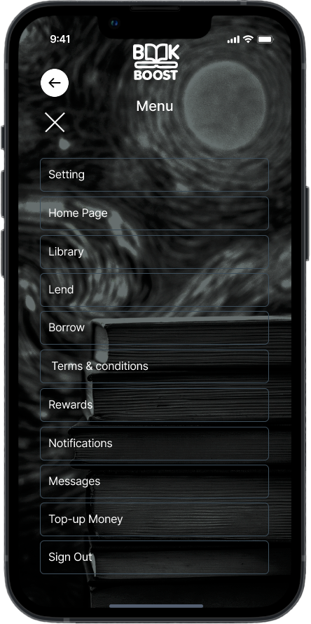
Menu
-
![]()
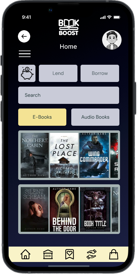
Home Page
-
![]()
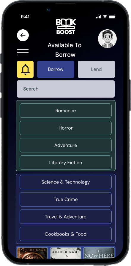
Available to Borrow
-
![]()
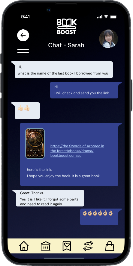
Chat Search
-
![]()
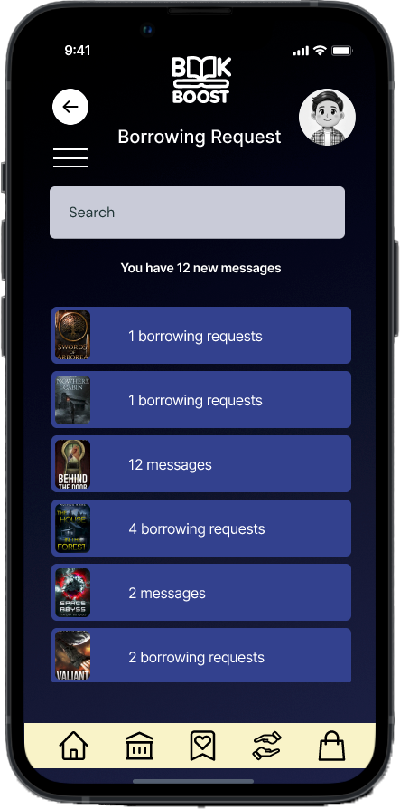
Borrowing Request
-
![]()
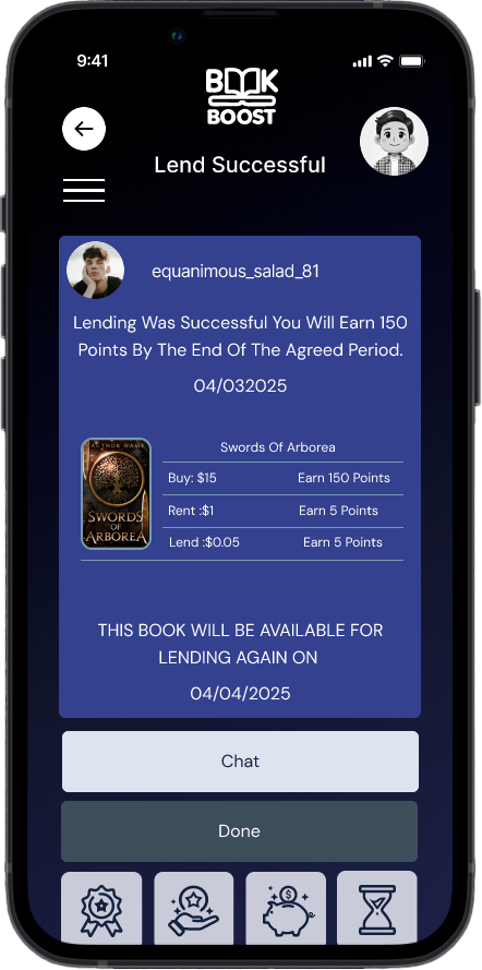
Lend Successful Message
-
![]()
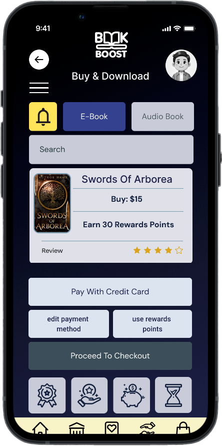
Buy & download
-
![]()
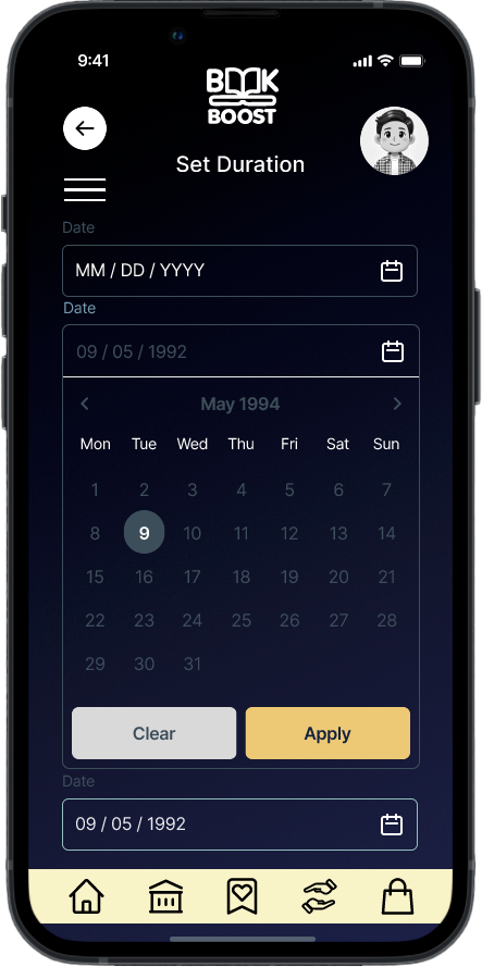
Set Borrowing Duration
-
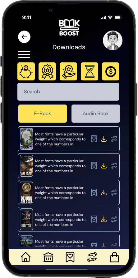
![Downloads]()
New List Item
-
![]()
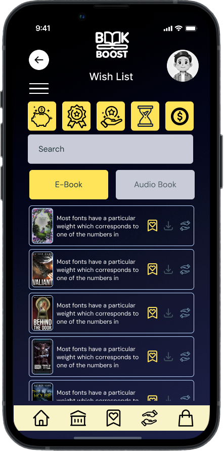
Wish List
-
![]()
Lend
-
![]()
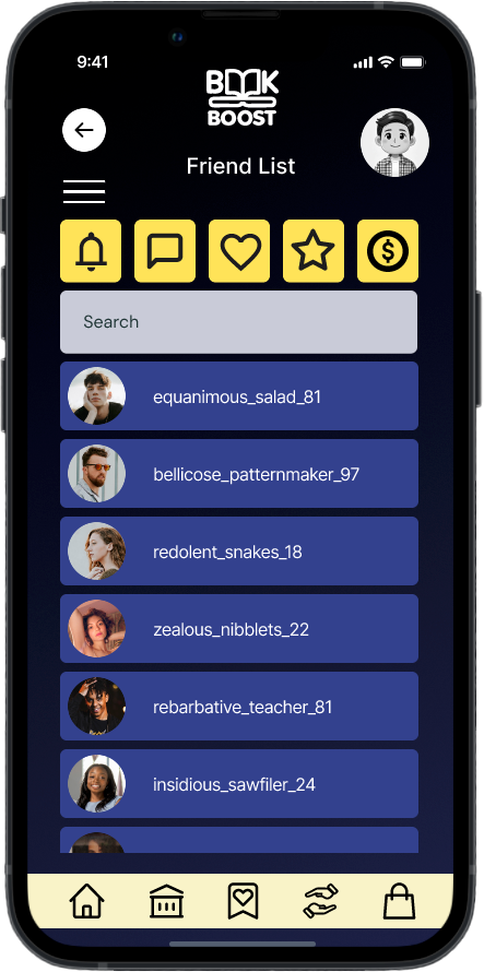
Friends List
-
![]()
Available to Borrow
-
![]()
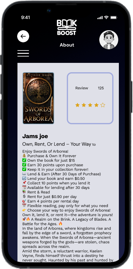
Book Description
-
![]()
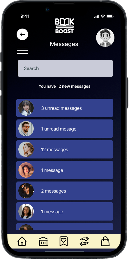
Messages
-
![]()
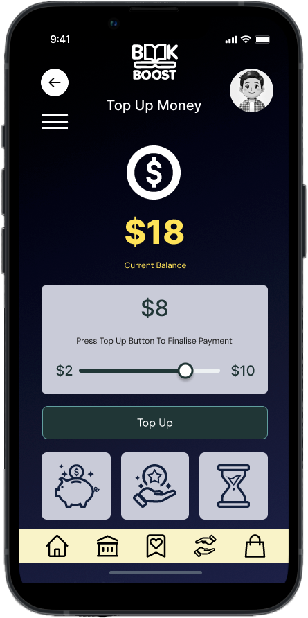
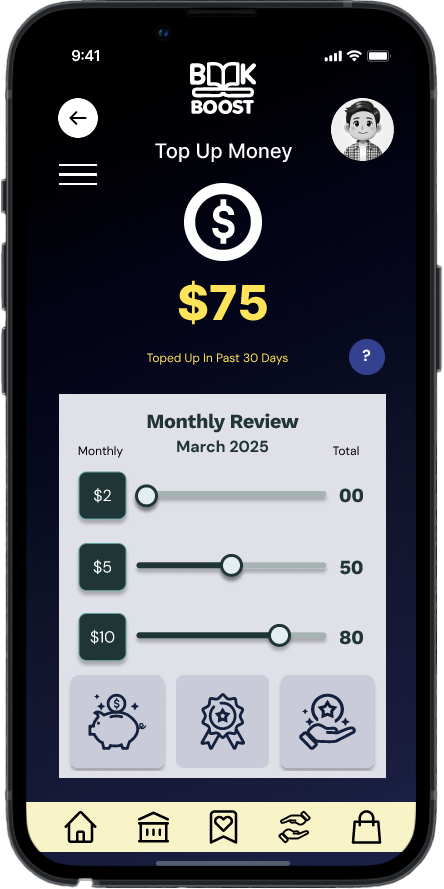
Top Up Money
-
![]()
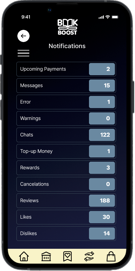
Notifications
-
![]()
Error Message
-
![]()
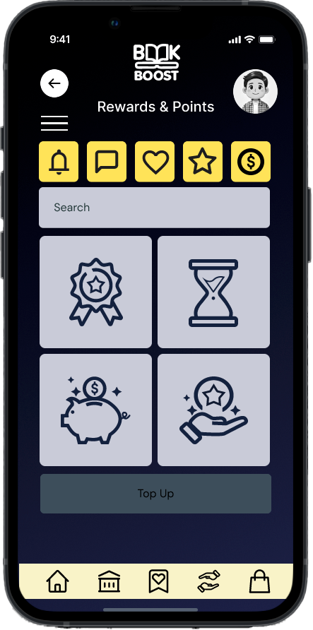
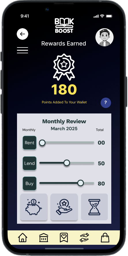
Rewards & Points
-
![]()
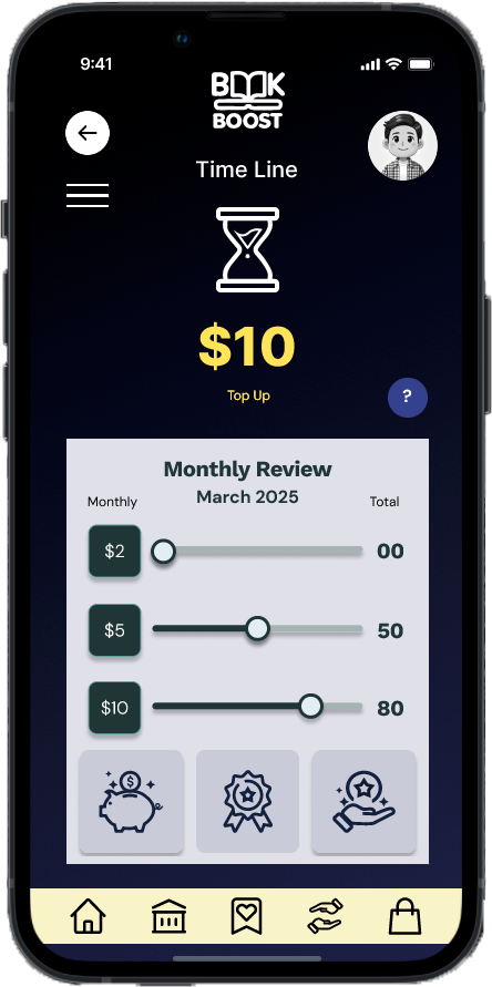
Earning Time Line
-
![]()
Top Up Money
-
![]()
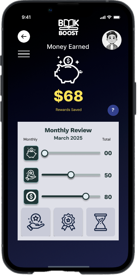
Money Earned
-
![]()
Reward Points
-
![]()
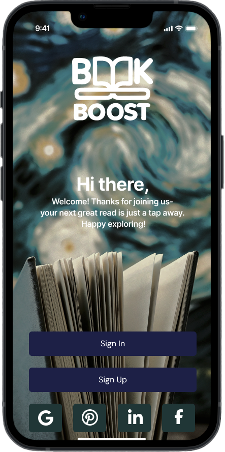
Landing Page
-
![]()
Account Setting


Findings After the First Build
In remote moderated mobile tests (6 users on a Figma prototype), the app scored a 90% task success rate, 2.8 min average completion, and 4.2/5 satisfaction. Strengths included a simple sign-in process, a clear button hierarchy/layout, a strong visual hierarchy, and motivating rewards. Friction points: the lending flow had too many manual steps, borrow confirmations weren’t explicit, some icons lacked instant meaning, and feature explanations were thin with confusion around profile edits and reward logic. Priorities: streamline lending (fewer inputs/ISBN autofill), add clear success feedback, introduce light onboarding/tooltips, and clarify icons/labels.
Summary
The usability testing of the BookBoost app confirmed strong user interest and ease in borrowing books, as well as appreciation for the reward system.
However, lending flow complexity, unclear feedback, and limited onboarding were consistent friction points.
The app presents a solid foundation, and the current prototype validates the core concept, but refinement is needed to enhance clarity, reduce user effort, and guide first-time users more effectively.
Next Steps
Conduct further testing on the lending process, focusing on reducing cognitive load and improving input flow
Introduce micro-interactions and clear feedback cues (e.g, confirmations) to build user confidence
Design and test a guided onboarding or tooltip system to educate new users on rewards and navigation
Review icon usage and labelling to ensure navigation clarity, especially for first-time users
Start a conversation and share a few lines about your project.